So Many Cities
- Nov 27, 2015
- 3 min read
This week has been productive after actually recieving some feedback and quite a lot of it too so I'm pretty happy in that respect.
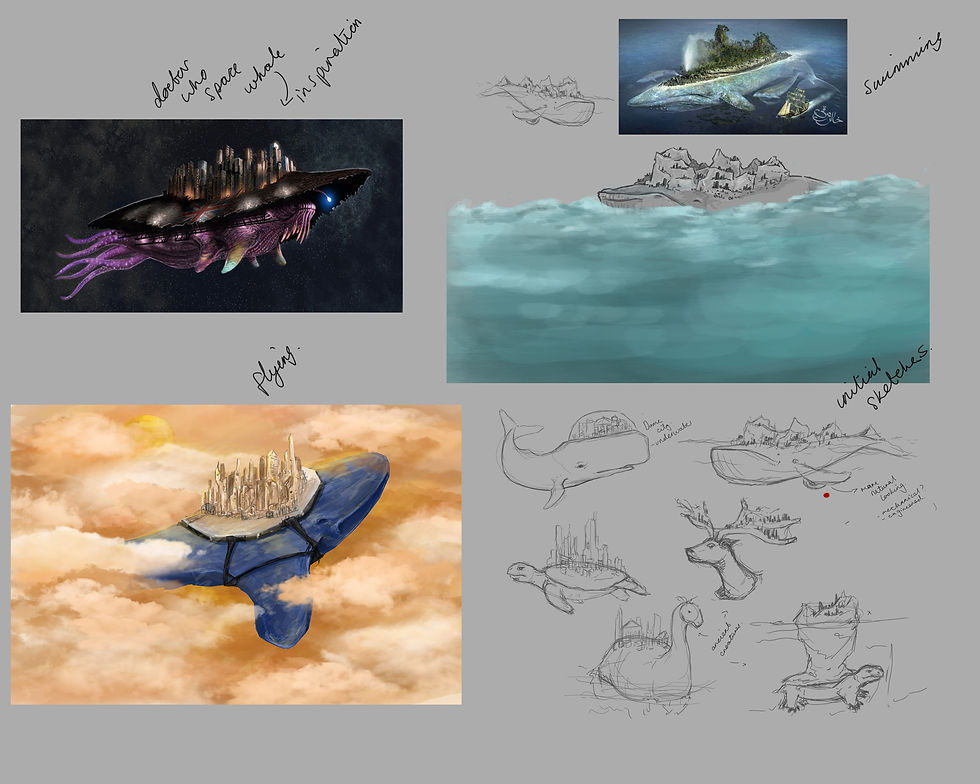
Micheal Powell gave me some very interesting ideas and references to merge into my work. For the whale city I've been working on he suggested I have a look at a Doctor Who episode which features London on the back of a space whale. It looks pretty off but it gave me some good ideas on how to make my whale more interesting. I decided eventually to try make the whale more fantastical and mystical.

After looking into some references I made this moodboard to show the images I looked at to influence my work.
For my colour exploration I wanted to also iterate the design and make it more magical so I tried making a few of them quite alien.
The best feedback I've gotten was for the second design which has my favourite colour palette of them all. So on Monday I decided to to carry that design forward and move onto my blockouts.

On Monday I managed to get all my blockouts done.


I did a number of really nice renders to paintover for my final paintings. Stas told me and Georgia a really good rendering technique by putting in a daylight and changing the environment lighting it creates this clean render.
I also worked on the colour palette for the sci fi city as I wanted to see what other colour options would work. I did some more research into what is already out there that could help me with my design, Interstellar was a big inspiration as I really do love that film.

These are the colour choices I came up with I think my favourite is still the first design as its sleek and simple. The final paintings of course will be more refined and detailed.


My final blockouts are quite basic but I'm only using them for paintovers and lighting.
This next design is one of my favourites as I think the colour palettes show a really cute style.

Mike Powell also talked to me about the Anasazi buildings which are these old buildinga created out of the cliff face. Not only is it interesting but it has such a dystopian feel to it. I plan to incorporate these buildings into my final paintings.

I'm actually very pleased with all of these paintovers for the colour palette. I was told a few times that the first painting is kind of reminiscent of Studio Ghibli, and as a fan that made me super happy.
I chose the second design after getting some conflicting opinions, however I wanted to do a desert scene.
So I got to work on the blockouts for this design too.


Sadly I had to drop my desert city design as I had five ideas in total and only four is needed but I had to drop one so I could get all the cities finished to a high standard.
I dropped the desert city which is why I also wanted to have a desert background and environment for the flying city design.
The last of my designs is the nature city. This is a city encased in two giant leaves as part of a large forest. I was struggling with how to merge organic structure like leaves and man made buildings together so Mike Powell suggested I look into Gaudi as he makes very natural buildings with organic shapes.

I was having trouble painting my colour palettes without it looking too busy as losing the focus of the design. Craig actaully helped me by showing me a book he had on how using greyscale can shift the focus. I tried to do this on the second painting. I did two more quick colour overlays and decided on the more greener design.

I think the blockouts I made for this design really helps separate the objects.


This is how my timeplan is looking currently. I'm on track if I work through the weekend which I will as I want to push myself and get the final paintings looking rad.

This weekend and final week of the project is simply all dedicated to painting the final city designs. But before that happens this is a little something I've been working on in my own time.

Comments