The Penultimate Week
- Feb 13, 2016
- 4 min read
This week was a bit of a mad one. As week four is the penultimate week, I really needed to pull my finger out and produce some fabulous looking work. Not only did I have a hell of a lot of work but this is the week where I contacted my mentor, Will Coyner.
Monday was a slow day, which was annoying for the amount I had to get done, although I managed to develop some of the designs for Teke Teke character, work on value studies and colour palette. I wanted this character to look eerie and creepy so I chose a fairly pale skin tone with bright eyes to draw the viewer’s eye there. I liked the use of the mostly red colour palette however I think it was just a bit too much in the end.
Georgia and I finally decided on the orange design, although it needed improving. When I painted the final for this character I wanted to make the clothing look more old and damaged, and to make her look very creepy in the moonlight.

On Monday I got around to thinking about what environments I could create. I was tasked with the job of designing the village, and also the shops and houses. I started to plan out the overall look of the village by end of the Monday.
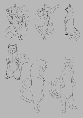
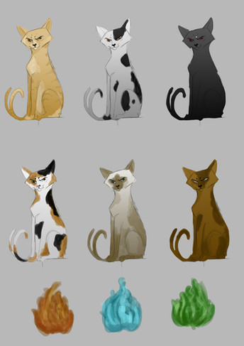
Tuesday came and went pretty quickly and I had to overrun into Wednesday to complete the Nekomata creature. I was really looking forward to drawing up some of these designs as I maybe just a little bit obsessed with cats… Over Tuesday and Wednesday I went through the whole process for this creature, from some initial sketches and getting the feel for the character, to the final painting.
The Nekomata is a normal domestic cat which has grown old and died. As the spirit of this animal comes back it's tail splits in two and the cat is now a Nekomata, which has the power of necromancy and also can control fire. Nekomata's love to set fires. Here is my initial final painting for this creature.

After completing the designs for this creature I sent them off to my mentor, Will for some feedback. Will helped me see the importance of composition and exaggerating certain features to show character and put the personality across. Every bit of feedback has been helpful and I plan to use it when I go back and refine my characters in the last week.
I started on another creature on Wednesday afternoon. This was the Sagari, the spirit of a horse that has died on the road which startles travellers by whinnying in their faces. This is a strange creature indeed but I kind of love all the weirdness. I didn’t want to spend too long on this creature as it’s not a main enemy, just a small NPC enemy which is more of a pain in the butt than anything dangerous. I began by sketching some studies of horses as they are super difficult to draw, props to anyone that can do that well. For these studies I chose to try choose angry and expressive facial expressions so I can replicate it for the final. For the final painting I used a mixture of hand painting and photo bashing.
Another interesting thing happened on Wednesday, we finished off the second test print for our book and sent it off for printing. On this test we chose a larger book size, different fonts on different backgrounds and following the Brave concept art book we tested how it looked to have transparent images in the background and having larger images which run off the page. Last time the book only took a week to arrive so we will see when it gets here. Once it does me and Georgia will review the second test print and start improving layout for the final book.
It’s already Thursday and I’ve been working on the designs for the village. I designed the entrance to the village by photo bashing and painting over it, I found it much less time consuming creating a concept like this. I’m happy that I’m trying out new ways to concept as I want to find which way is best for me, and it also can save me some time.

I started with a range of sketches for each of the Japanese shops which the main character can enter and buy potions or weapons. I started with the potion shop at first I just sketched out some ideas, I would then talk to Georgia about which ones she liked best and improve it for the next iteration. The potion shop has a really nice shape and silhouette to it which will help the player when navigating through the village. We decided that the shops the player can go into should stand out more and be easier to see to lead the player there almost, to do this I tried to make the silhouette of the building interesting and to have a bright colour scheme. For the potion shop we both decided on the red and white building as its more prominant and not as messy as teh blue and orange.
[if !supportLineBreakNewLine]

Thursday I also go onto drawing up some iterations for the weapon shop too. Me and Georgia both liked the design which is kind of merged into the mountains, this makes the journey to the building more interesting. I chose to take that idea and run with it so I decided to take the design and iterate upon it. Here are the colour iterations that I did for the weapons store. In the end we chose the green and red as its eye catching and appealing.

On Friday I spent most of my time iterating both the potion store and weapons store, and nearing a final design. The designs for the normal houses were completed on Friday and I managed to finish the colour designs over the weekend. I really like a lot of the generic houses as they are fairly simple and toned down compared to the shops which you can enter.


Comments